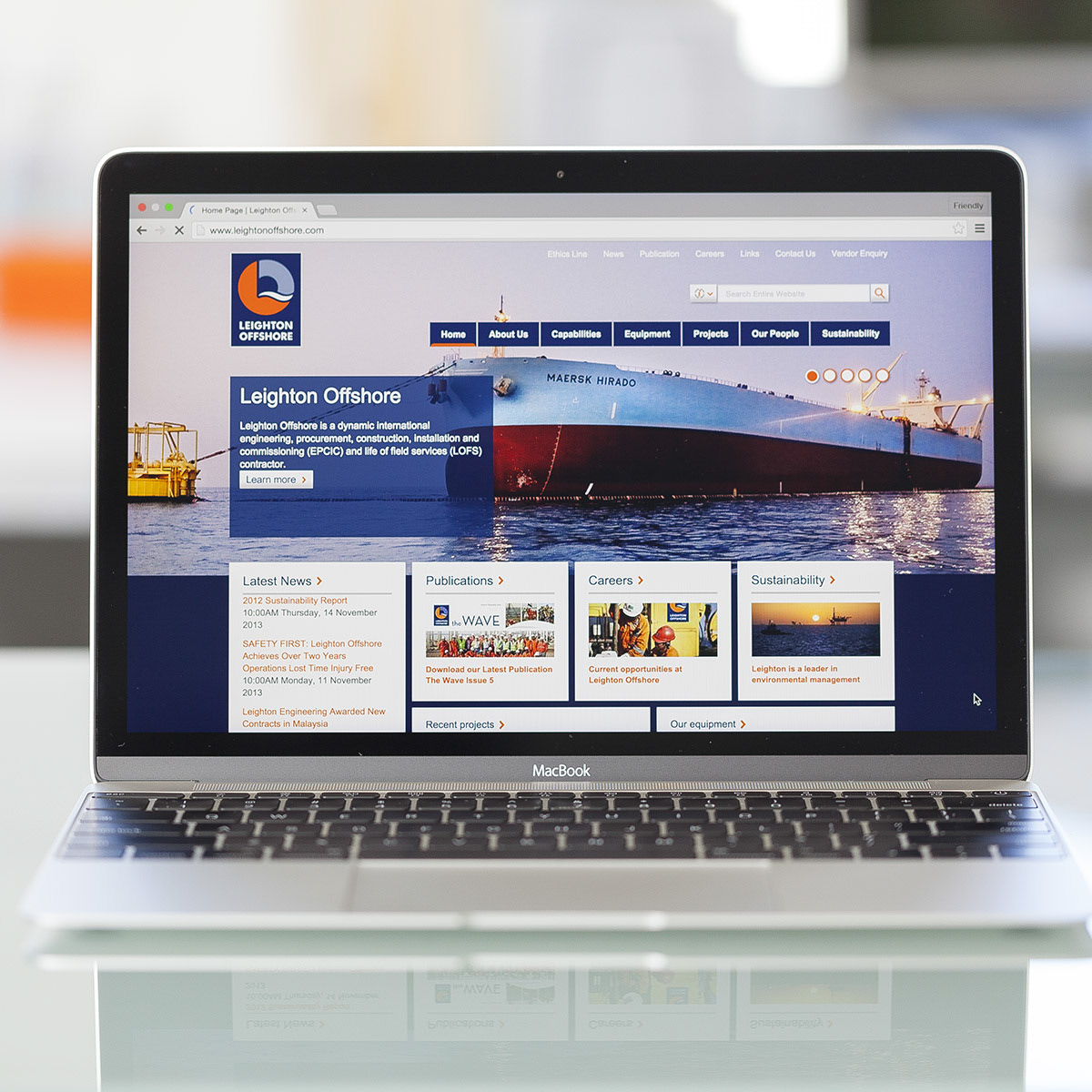
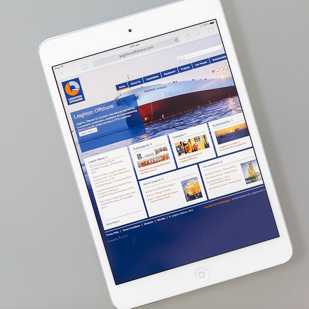
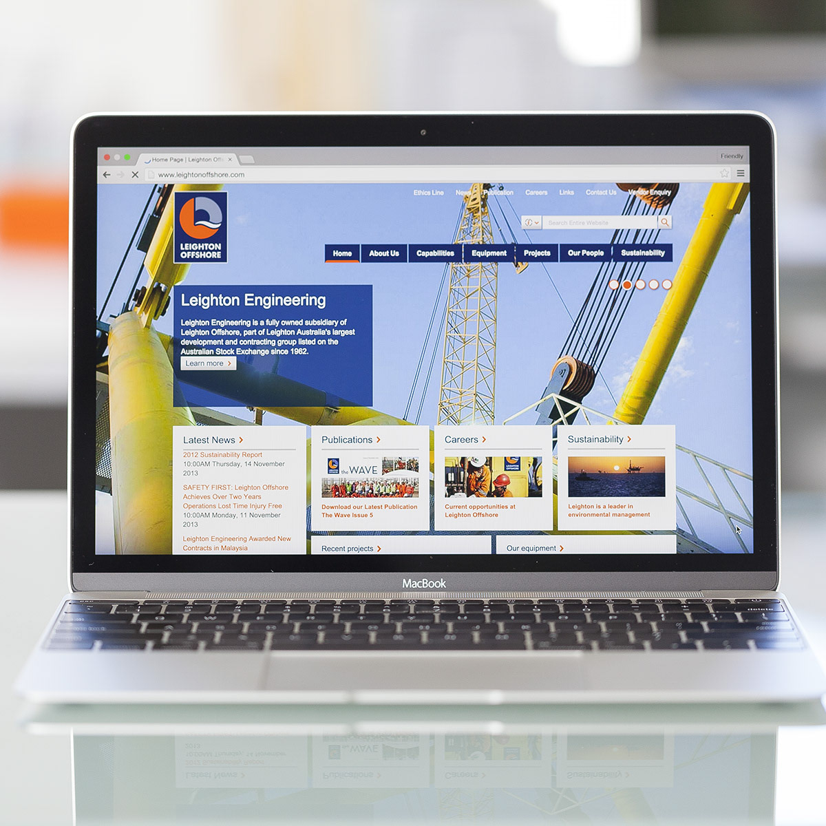
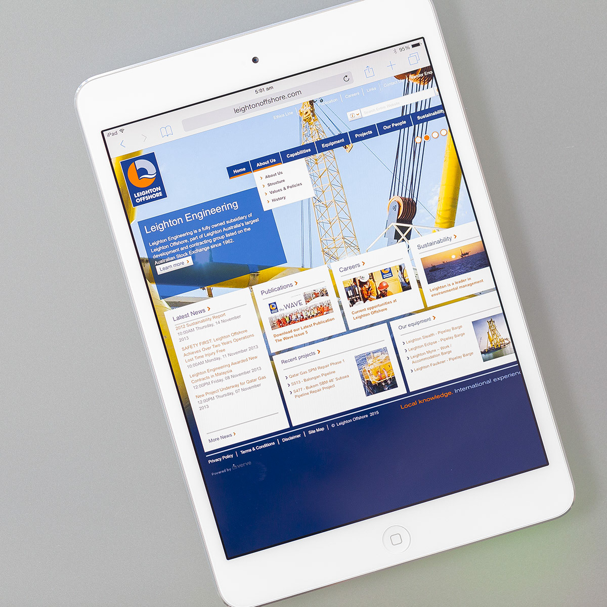
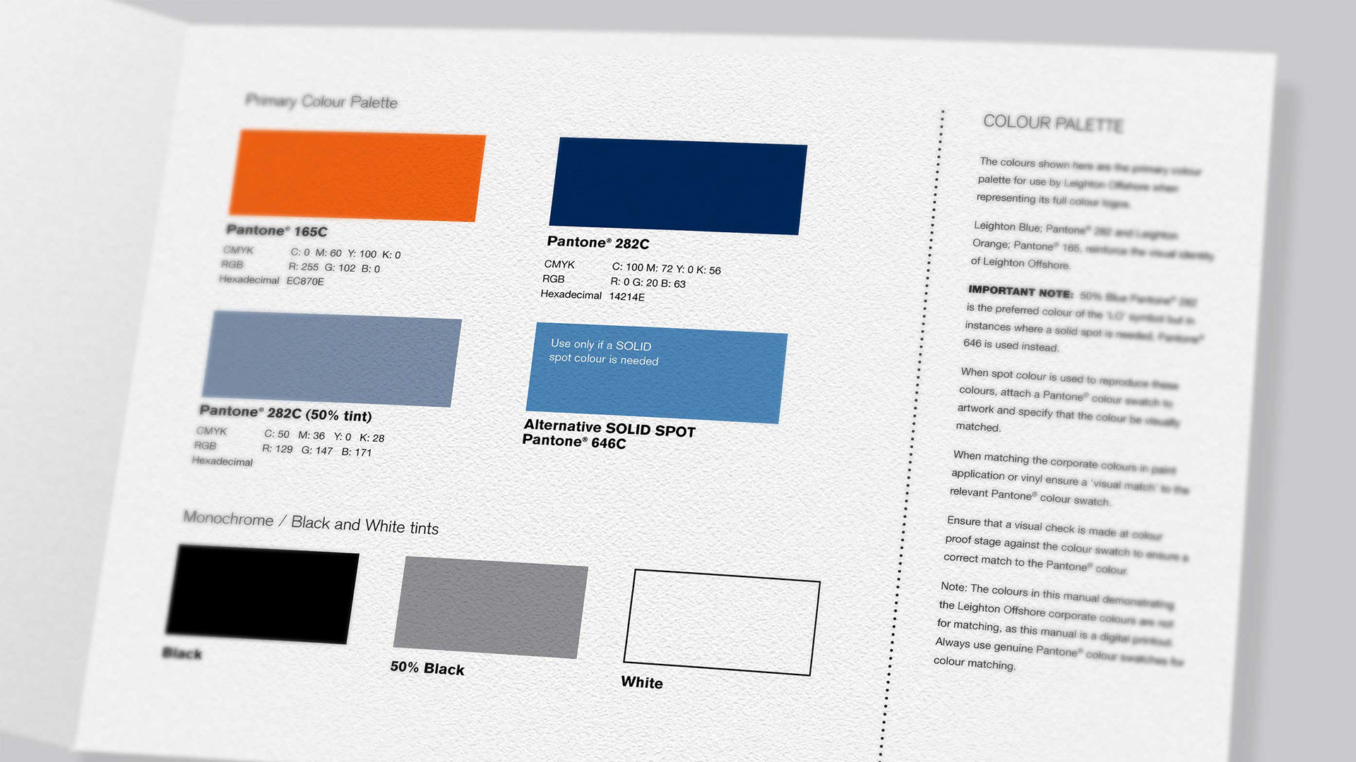
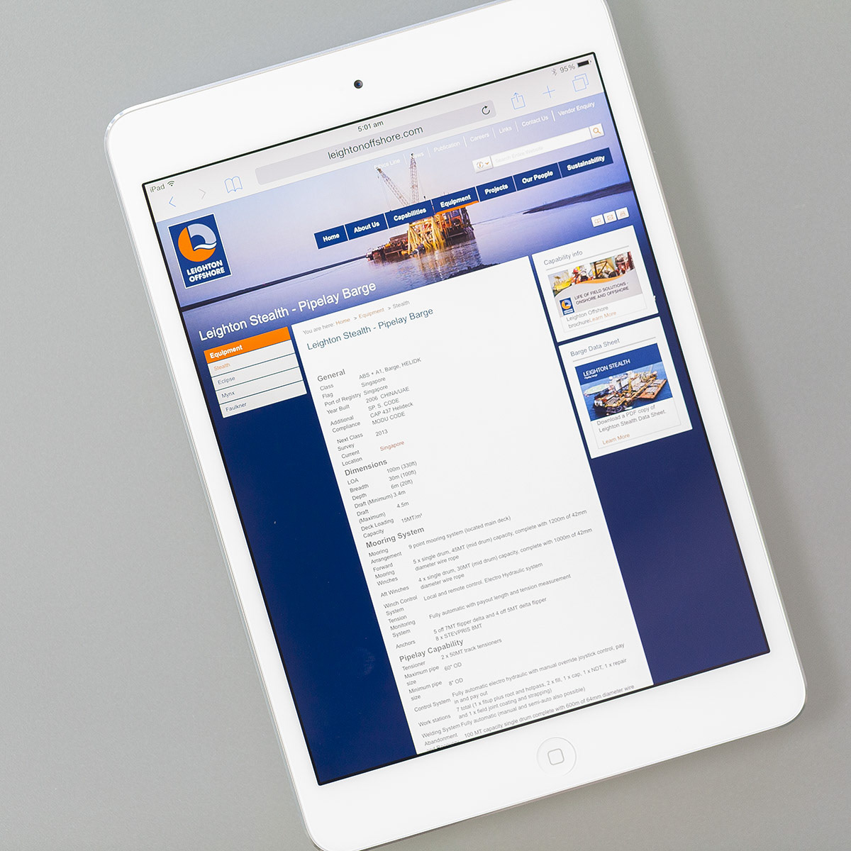
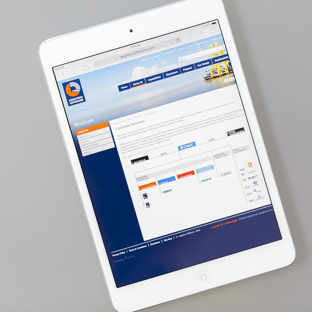
Leighton Offshore is a dynamic international engineering, procurement, construction and installation contractor. It needed its own brand identity from its parent company Leighton Holdings.
SOLUTION:
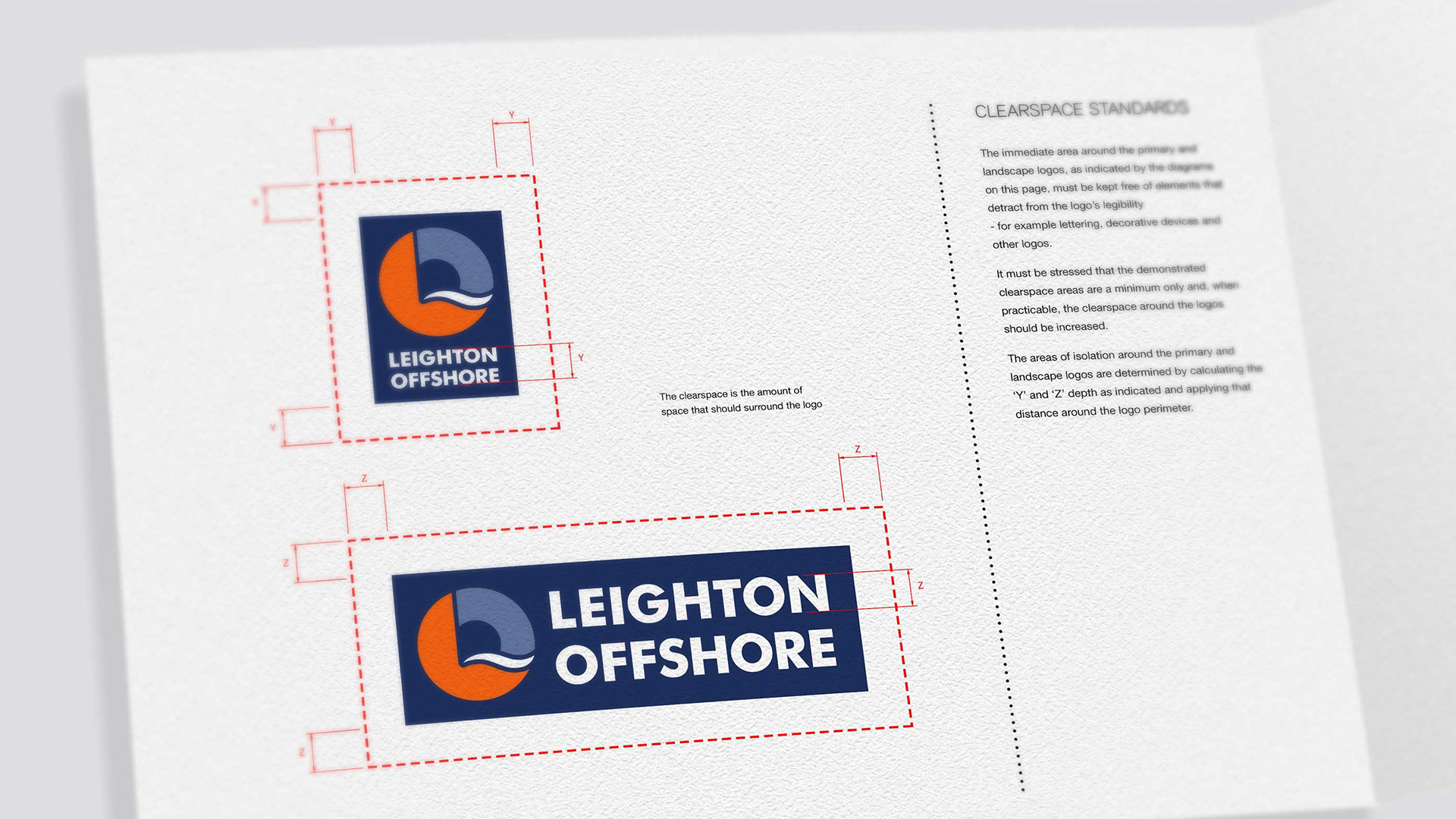
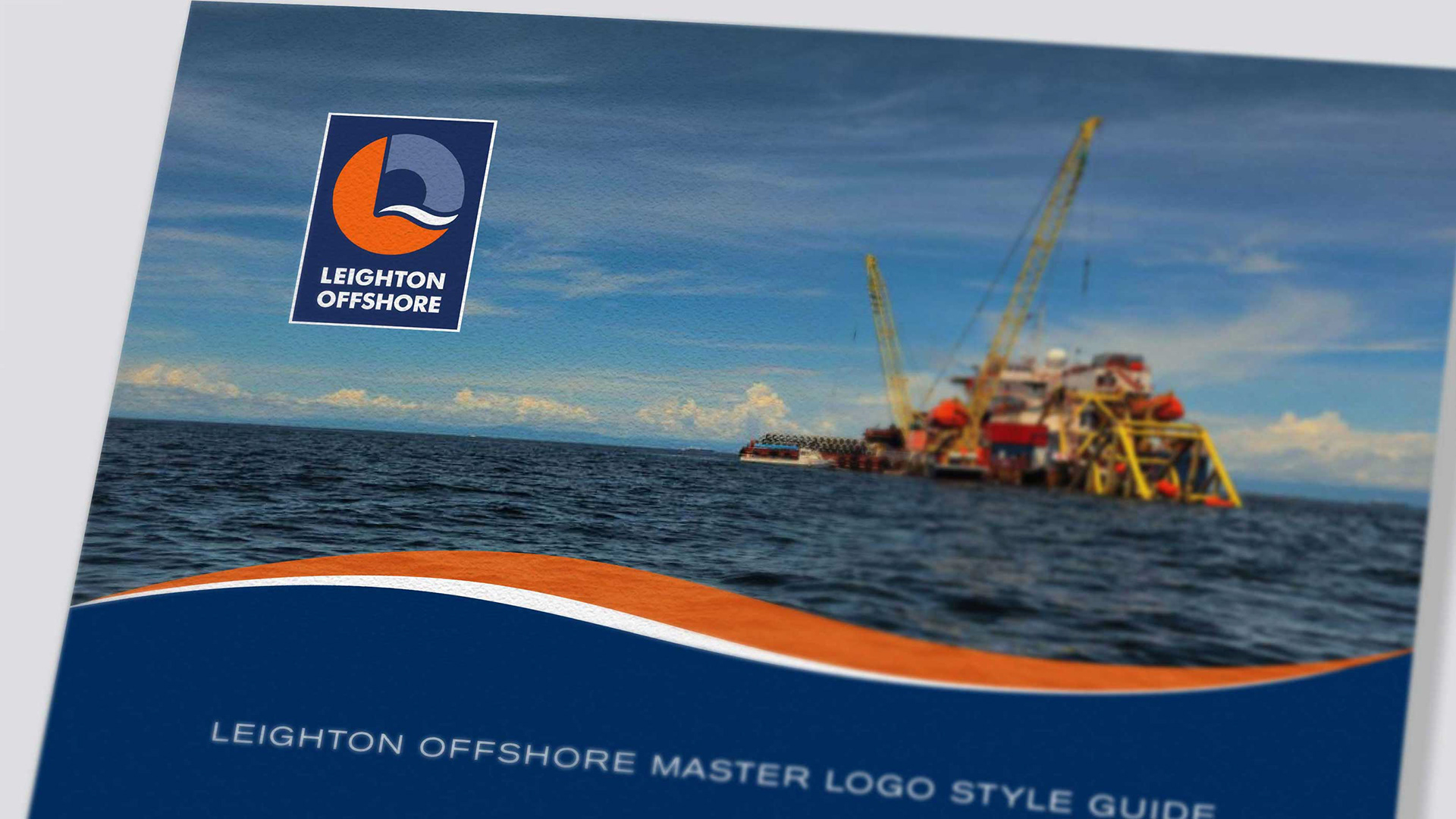
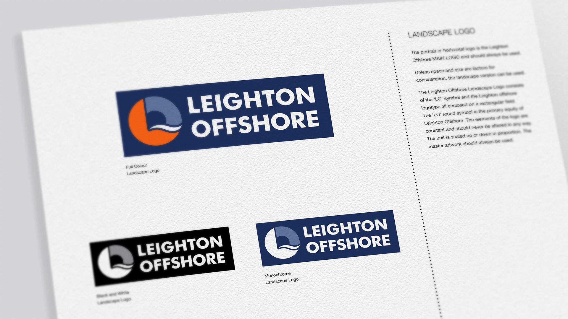
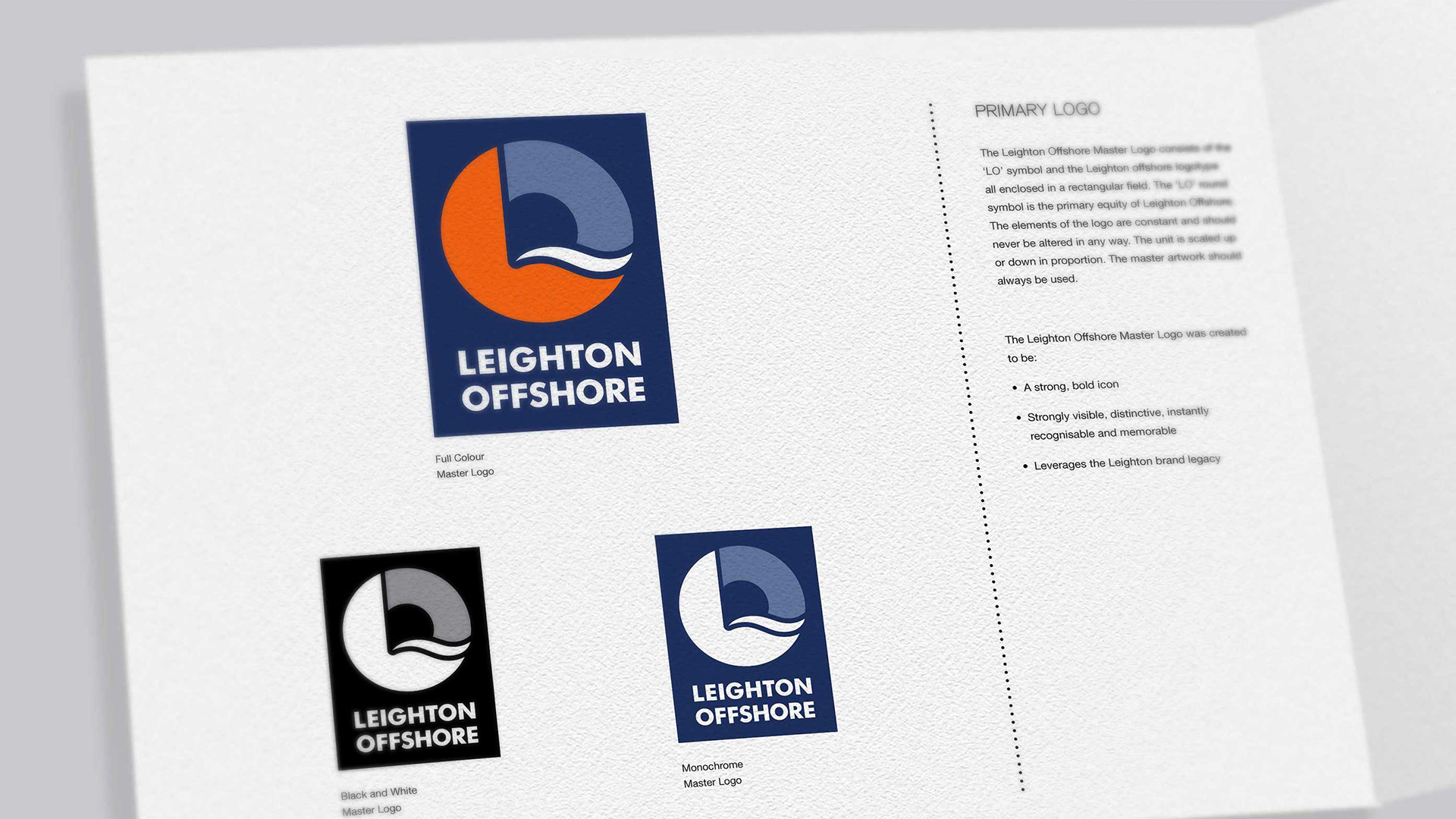
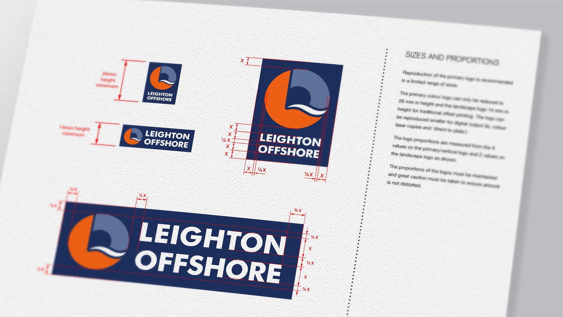
I designed a simple and iconic logo that demonstrates its strengths and it's international reputation.
Land, sea, shore. It is all included within the logo. The 'L' symbol still reflected a strong relationship with its parent company.
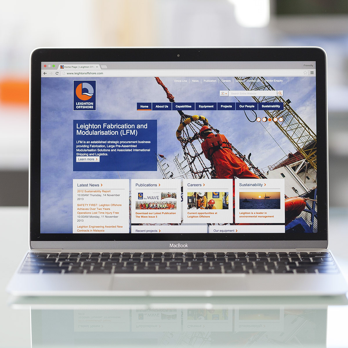
A strong 'dynamic wave' visual was created as a visual identity unique in the industry which was rolled out in all communications.
Agency: The Friendly Agency
Branding and Design Direction: Noel Santos
UX/UI Design: Dale Thornton
